

|
|
|
 April 2nd, 2013, 20:38
|
#1 |
|
|
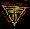
Finch field needs your help!!
WE NEED YOUR HELP IN CHOOSING OUR NEW PROMOTIONAL POSTER!
please look at both posters and help us decide just simply post yellow or orange (symbolizing the double f symbol) thanks for your help guys! Last edited by primo; April 2nd, 2013 at 20:41.. |

|

|
|
April 2nd, 2013, 20:43
|
#2 | ||
|
ksuechuc
|
yellow logo, but the position of the slogan should be moved to align along the bottom of the logo
__________________
Quote:
Quote:
|
||
|
|
|
|
April 2nd, 2013, 20:50
|
#3 | ||
|
Oh we do hate you, just never felt like wasting the time to give you a user title :P
|
I like both but the yellow one if it could have "come meet" along the left of the triangle and "your maker" along the right would look cleaner AND that could esaly be made into a patch
__________________
Quote:
Quote:
FinchFieldAirsoft |
||
|
|
|
|
April 2nd, 2013, 20:58
|
#4 | ||
|
ASC's Whiny Bitch
|
Quote:
__________________
Quote:
Certified Level 3.1415926 Orbital Weapons platform Certified |
||
|
|
|
|
April 2nd, 2013, 21:00
|
#5 | ||
|
Oh we do hate you, just never felt like wasting the time to give you a user title :P
|
 Sry i did it on my phone so it looks like ass but you get the idea
__________________
Quote:
Quote:
FinchFieldAirsoft |
||
|
|
|
|
April 2nd, 2013, 21:15
|
#6 |

|
yellow
__________________
Smuf: (Ceasar's Ghost) & (Caledon Airsofter) [SIGPIC][/SIGPIC]
|
|
|
|
|
April 2nd, 2013, 21:23
|
#7 |
|
|
Yellow, and I like Hectic's idea of having the wording around the logo. It will make a great patch
|
|
|
|
|
April 2nd, 2013, 21:31
|
#8 | |
|
|
yellow
would translate better into a bagDGE 
__________________
Quote:
Last edited by BennyBoy; April 2nd, 2013 at 21:33.. |
|
|
|
|
|
April 2nd, 2013, 21:34
|
#9 |
|
Mexifaggot
|
The top red text is hard to read with that 3D effect and doesn't contrast too well with the black since its a dark red. To be honest I'd leave the logo and all the text just flat against the background with no angle effects. If you wanna make patches eventually and signage and stuff it's best to keep it simple.
__________________
Guardians of Asgaard - KF25 - Primaries: LCT AK74MN w/SKTBR, VFC M4 SOPMOD Block 2 Secondary: Latino heat, TM Glock 17 |

|
|
|
April 2nd, 2013, 21:44
|
#10 |
 A Total Bastard A Total Bastard |
The yellow one, and use the Font from the first one, straight across the top of the logo.
__________________
W1-5 |
|
|
|
|
April 2nd, 2013, 21:44
|
#11 |
|
A Total Bastard |
Triangle. Ditch the motto. I think you guys can do better than that phrase to sum up how awesome FF is.
__________________
VINCITE OMNIMODO
|
|
|
|
|
April 2nd, 2013, 21:47
|
#12 |
|
|
yellow!
__________________
 AKMS TYPE 56-1 |
|
|
|
|
April 2nd, 2013, 21:50
|
#13 |
|
PinkEagle
|
Make sure ther are no inFRINGEment issues with the logo, lol.
__________________
  G63 |
|
|
|
|
April 2nd, 2013, 22:01
|
#14 | |
|
|
As is good for banner but flat undistorted yellow for patchs =D
You are making patches right?!
__________________
Quote:
|
|
|
|
|
|
April 2nd, 2013, 22:38
|
#15 | |
|
|
Quote:
it is the Fringe logo , I knew I recognized it. I do like that one as well, so "Yellow"
__________________
http://www.facebook.com/RaptureTeamAirsoft |
|
|
|
|
  |
|
||||||
| Bookmarks |
|
|
 |
|


